
Overview
The Button widget in DesignSute helps you create eye-catching, flexible call-to-action buttons that fit perfectly into any layout. With multiple layout styles, hover effects, icon support, and advanced alignment options, you can design buttons that not only look great but also guide users to take action.
Whether you’re building landing pages, hero sections, or promotional banners, the Button widget gives you full creative control—no custom CSS required.
Key Features
- 6 unique button layout styles
- 7 stylish hover effects
- Icon support with flexible positioning
- Icon position control (before or after text)
- Direction control (row or column layout)
- Full alignment options
- Button stretch option for full-width buttons
- Responsive design support
Ideal for:
- Call-to-action buttons
- Hero section buttons
- Pricing tables
- Forms and navigation elements
How to Activate the Button Widget
Before using the Button widget, ensure it is enabled from the DesignSute Dashboard.
Steps to Enable:
- Go to DesignSute → Dashboard → Widgets (Tab) in your WordPress dashboard.
- Locate the Button widget in the list.
- Toggle it ON to enable.
- Save changes if required.
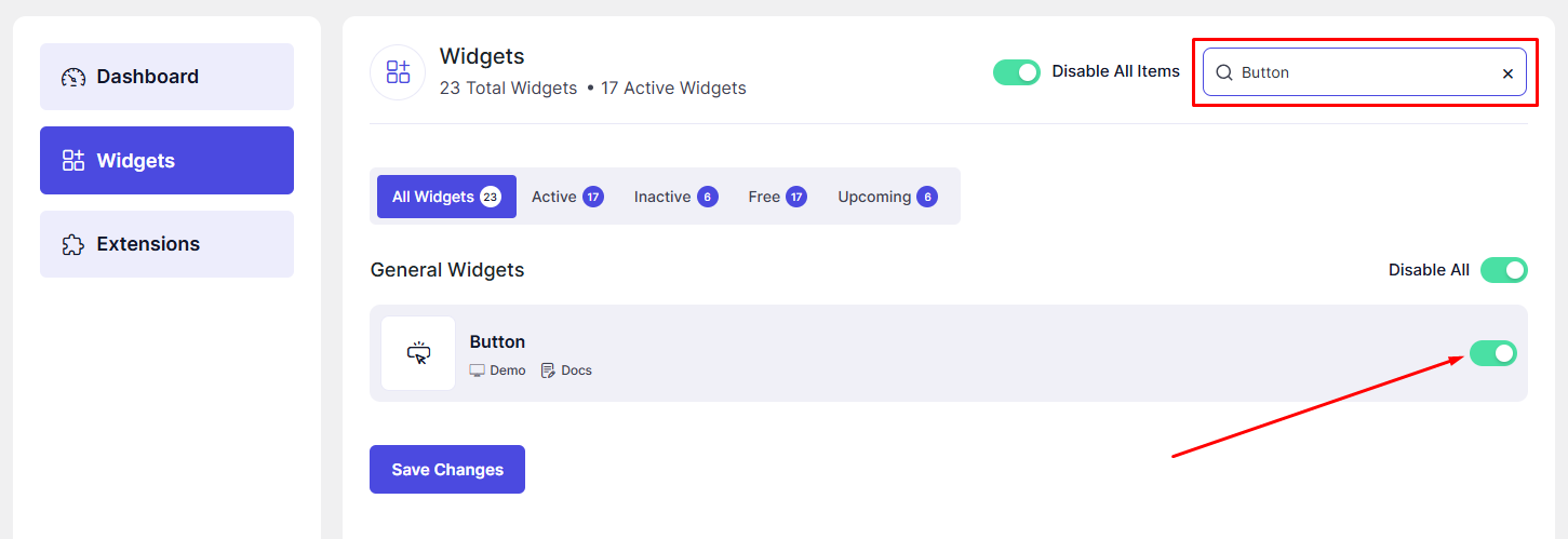
Now, the Button widget is ready to use in Elementor.
How to Add a Button Widget in Elementor
- Open your page in the Elementor Editor.
- In the Elementor panel, search for “Button” under DesignSute widgets.
- Drag and drop the widget into your desired section or column.
- Start customizing the button using the Content, Style, and Advanced settings.
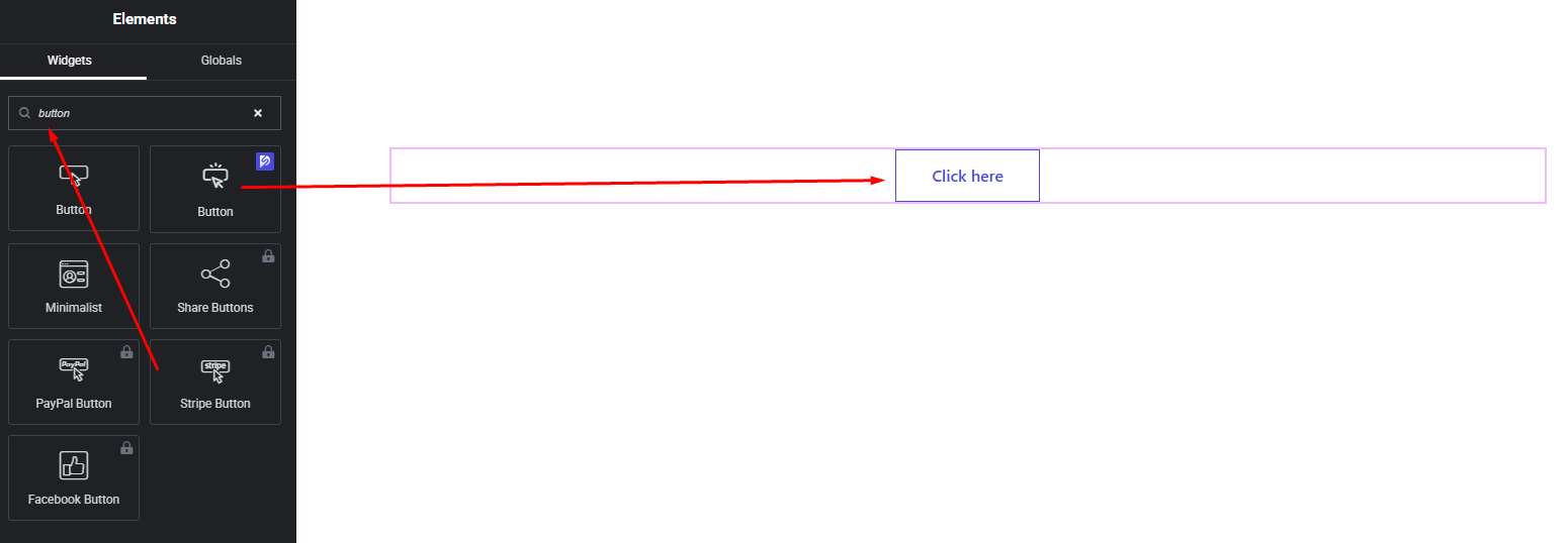
Your Button widget is now added and ready to customize.
Content Settings
The Content tab allows you to define the structure and behavior of your button.
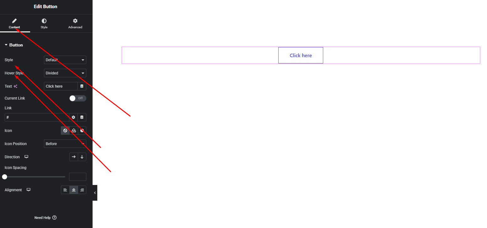
Available Options:
- Button Text – Enter the text you want to display on the button.
- Link – Add a URL to make the button clickable.
- Layout Style – Choose from 6 different layout styles to define the button’s overall appearance.
- Hover Style – Select from 7 hover animation styles to enhance interactivity.
- Icon – Choose an icon to display with the button text.
- Icon Position – Set the icon position:
- Before Text
- After Text
- Direction – Control the layout direction:
- Row (icon and text side-by-side)
- Column (icon above or below text)
- Alignment – Align the button left, center, or right within its container.
These settings allow you to quickly build functional and visually appealing buttons.
Style Settings
The Style tab gives you full control over the visual design of your button.
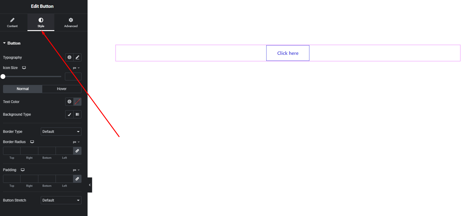
Button Styling Options:
- Typography – Customize font family, size, weight, line height, and letter spacing.
- Text Color – Set the default and hover text colors.
- Background Color – Customize background colors for normal and hover states.
- Border & Radius – Control border style, width, color, and corner radius.
- Button Stretch – Enable this option to make the button stretch to full width.
- Spacing – Adjust padding and spacing for better balance.
These options help you design buttons that match your site’s branding and layout perfectly.
Advanced Settings
The Advanced tab provides additional layout and animation controls.
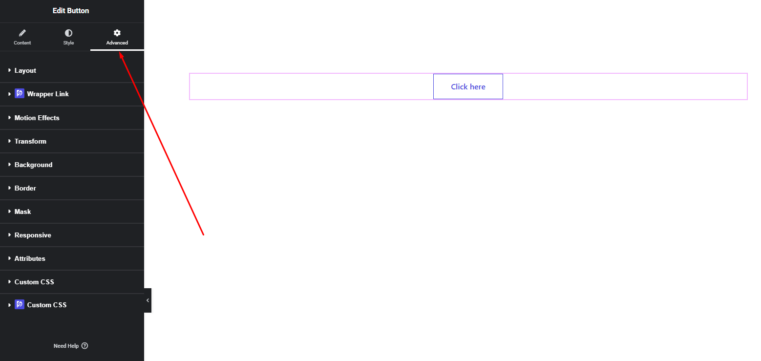
You can configure:
- Margin & Padding
- Motion effects
- Responsive visibility
- Custom positioning
- Background overlays
- CSS classes (if needed)
Use these options to fine-tune spacing, responsiveness, and advanced behavior.
Final Outcome
Congratulations! 🎉
You’ve successfully configured the DesignSute Button Widget to create powerful, stylish call-to-action buttons. With multiple layout styles, hover effects, icon flexibility, and stretch options, your buttons will stand out and encourage user interaction across your website.
If you have any questions or need assistance, feel free to reach out to our support team.


