
Overview
The Heading widget in DesignSute allows you to create powerful and visually engaging titles for your website. Whether you’re building hero sections, service blocks, or call-to-action areas, this widget gives you full control over styling, highlighting, and advanced text effects.
With support for highlighted text, blend modes, text stroke, shadows, typography controls, and more — you can easily design attention-grabbing headings without writing any custom CSS.
Key Features
Highlight specific words using simple bracket format (example:
[Your Text])Full alignment control (left, center, right)
Advanced blend mode options
Text stroke customization
Text shadow effects
Complete typography controls
Custom color options
Responsive design support
Perfect for:
Hero section titles
Section headings
Feature highlights
Promotional banners
How to Activate the Heading Widget
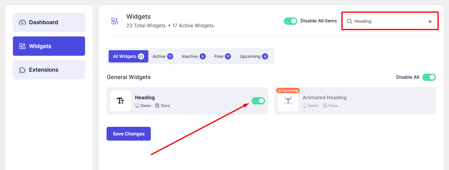
Before using the Heading widget, make sure it is enabled from the DesignSute Dashboard.
Steps to Enable:
Go to DesignSute → Dashboard → Widgets (Tab) in your WordPress dashboard.
Find the Heading widget in the list.
Toggle the switch to enable it.
Click Save Changes (if applicable).
Now, the Heading widget is ready to use in Elementor.
How to Add a Heading Widget in Elementor
Open the page with Elementor Editor.
In the Elementor panel, search for “Heading” under the DesignSute widgets section.
Drag and drop the widget into your desired section or column.
Start customizing using the available Content, Style, and Advanced settings.
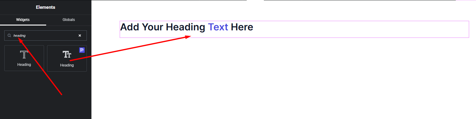
Your Heading widget is now added and ready to be customized.
Content Settings
The Content tab allows you to configure the main heading structure and alignment.
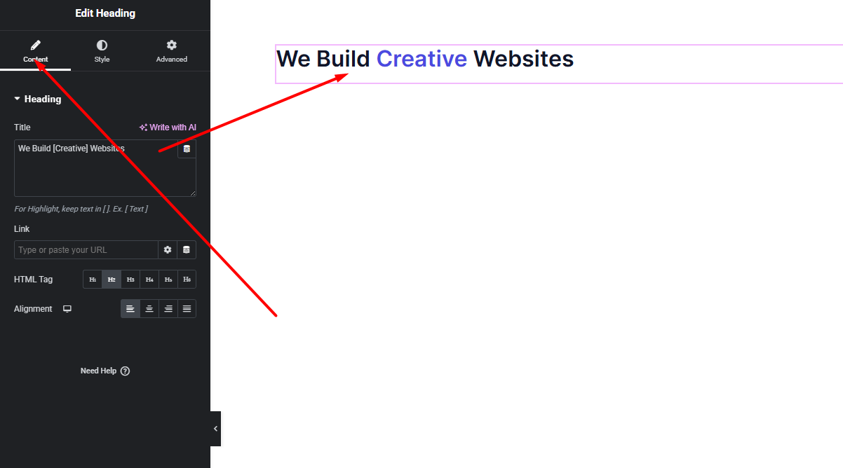
Available Options:
Title – Enter your heading text here.
To highlight specific text, wrap it inside brackets like this: Example:
We Build [Creative] WebsitesThe text inside brackets will automatically apply highlight styling.
HTML Tag – Choose the appropriate HTML tag (H1, H2, H3, etc.) for proper SEO structure.
Alignment – Select how the heading aligns (Left, Center, Right).
These settings help you create a properly structured and highlighted heading for your layout.
Style Settings
The Style tab gives you full control over the appearance of your heading text.
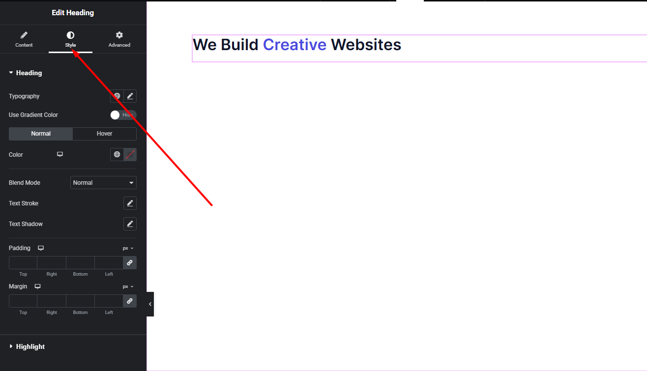
Text Styling Options:
Typography – Customize font family, size, weight, line height, letter spacing, and more.
Text Color – Set the main color of the heading text.
Highlight Color – Choose a different color for the bracket-highlighted text.
Blend Mode – Apply creative blending effects to make your heading interact with background elements.
Text Stroke – Add outline effects to your text by adjusting stroke width and stroke color.
Text Shadow – Add depth and dimension using shadow blur, horizontal/vertical offset, and shadow color.
With these options, you can create modern, bold, elegant, or even artistic headline designs.
Advanced Settings
The Advanced tab includes additional controls to further enhance your design flexibility.
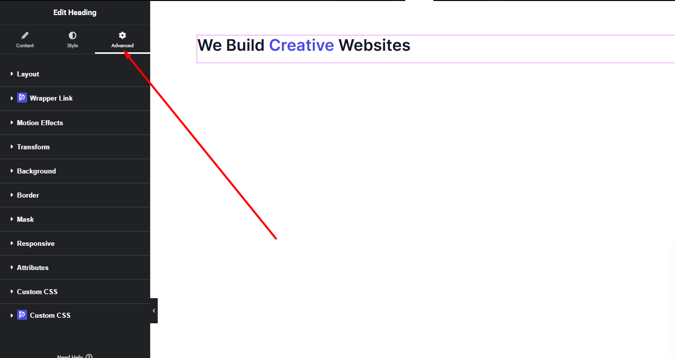
Here you can access:
Margin & Padding
Responsive visibility controls
Motion effects
Custom positioning
Background & border settings
Experiment with these options to refine spacing, responsiveness, and advanced layout behavior.
Final Outcome
Congratulations! 🎉
You’ve successfully configured the DesignSute Heading Widget to create stunning, customizable titles for your website. With highlight text, advanced styling, and powerful design controls, you can now build visually engaging sections that capture attention instantly.
If you need any further assistance or have questions about the Heading widget, feel free to reach out to our support team.


