
Overview
The Nav Menu widget allows you to display any WordPress menu inside Elementor with full layout, responsive, and styling control. You can create horizontal or vertical menus, customize hover effects, add submenu indicators, and enable a fully responsive mobile menu with a custom breakpoint.
This widget is ideal for building headers, side menus, footers, and mobile navigation without touching any code.
Key Features
- Select menu from WordPress Menus
- Submenu indicator support
- Layout options: Horizontal & Vertical
- Hover pointer effects
- Responsive mobile menu
- Custom breakpoint for mobile view
- Full style customization
Perfect for:
- Website headers
- Sticky navigation
- Sidebar menus
- Mobile-friendly layouts
How to Activate the Nav Menu Widget
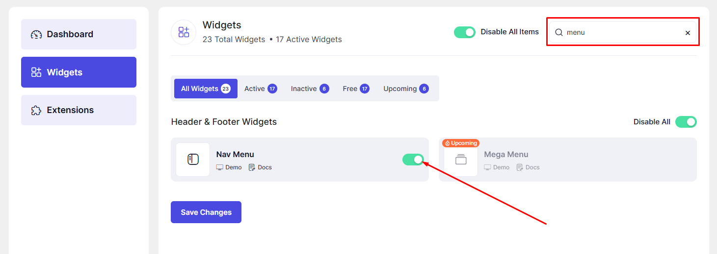
Before using the widget, ensure it is enabled in the DesignSute Dashboard.
Steps to Enable:
- Go to DesignSute → Dashboard → Widgets (Tab).
- Locate the Nav Menu widget.
- Toggle it ON.
- Save changes if needed.
How to Add the Nav Menu Widget in Elementor
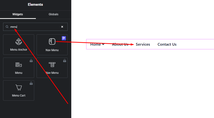
- Open your page in Elementor Editor.
- Search for “Nav Menu” in the widget panel.
- Drag & drop it into your desired section (header, column, sidebar, etc.).
- Choose your menu and layout.
Content Settings
The Content tab controls menu selection, layout, and responsive behavior.
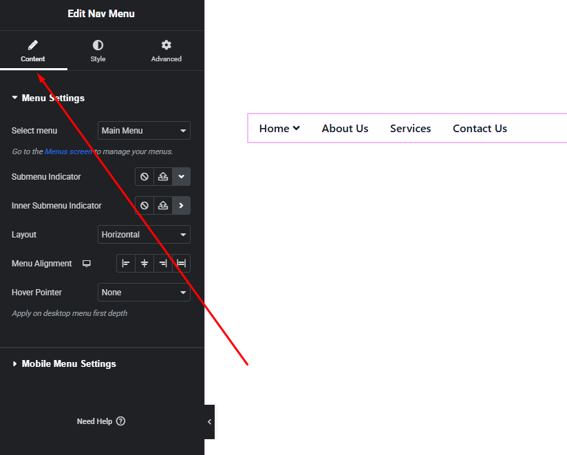
Menu Settings
- Select Menu
- Choose from any menu created in Appearance → Menus.
- Layout
- Horizontal – Ideal for headers
- Vertical – Ideal for sidebars or mobile menus
- Submenu Indicator
- Enable or disable submenu arrows/icons
- Improves navigation clarity for dropdown menus
Mobile Menu Options
- Enable Mobile Menu
- Automatically switches menu to mobile mode
- Breakpoint
- Define screen width where mobile menu activates
- Example: 1024px, 768px
- Mobile Toggle
- Hamburger icon or custom icon
- Open / close menu behavior
This ensures smooth navigation across desktop, tablet, and mobile devices.
Hover Pointer
- Pointer styles such as:
- Underline
- Overline
- Background
- Border
- Smooth hover animations
- Active menu item highlighting
These options enhance usability and visual feedback.
Style Settings
The Style tab gives full control over menu appearance.
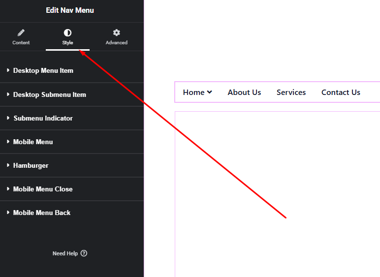
Menu Items
- Typography (font, size, weight, spacing)
- Text color (normal, hover, active)
- Padding & spacing between items
Submenu Style
- Background color
- Border & border radius
- Box shadow
- Submenu spacing
Mobile Menu Style
- Toggle icon color & size
- Mobile menu background
- Item spacing & alignment
You can fully match the menu style with your website branding.
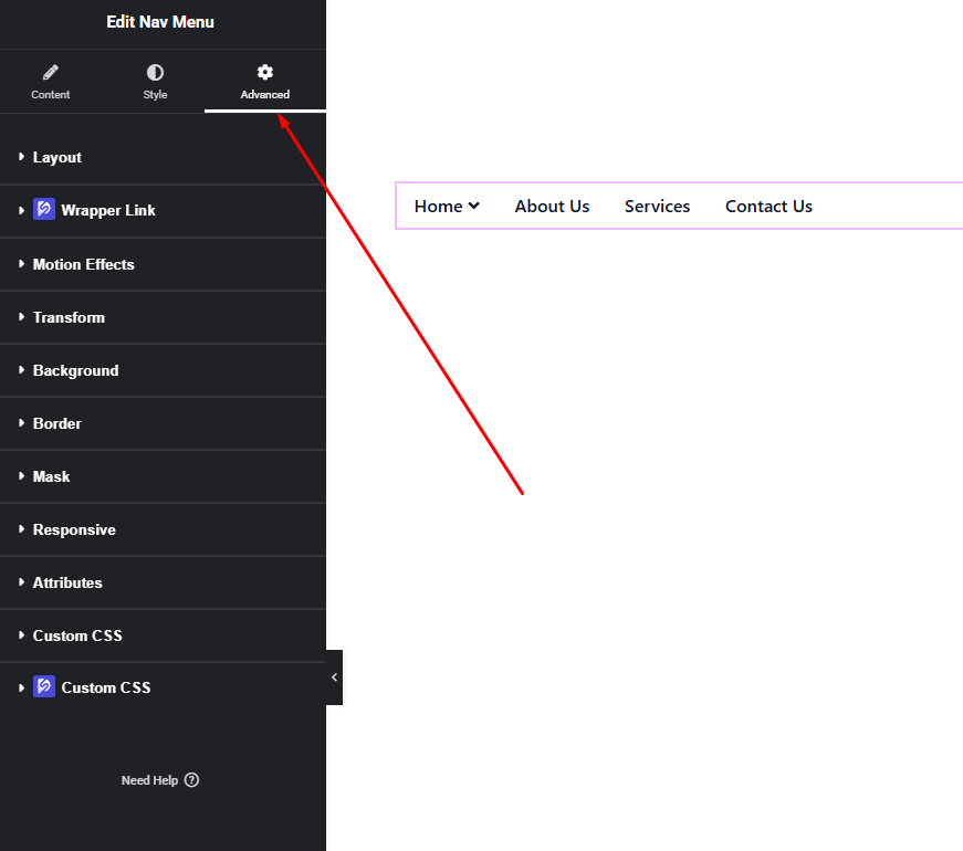
Advanced Settings
Includes:
- Margin & padding
- Background & borders
- Motion effects
- Responsive visibility
- Custom positioning
Final Outcome
✅ You now have a fully responsive and customizable Nav Menu using DesignSute.
From desktop headers to mobile menus, this widget gives you total control over navigation structure and design—without extra plugins or code.


