
Overview
The Info Box widget in DesignSute helps you highlight key information in a visually structured and engaging way. Whether you’re showcasing services, features, benefits, or call-to-action blocks, this widget allows you to combine icons or images with titles, descriptions, and buttons—all within a clean, flexible layout.
With multiple layout styles, icon or image support, and detailed styling controls, the Info Box widget is perfect for building modern, conversion-focused sections.
Key Features
- 2 layout styles
- Icon or image support
- Title HTML tag selection (H1–H6)
- Button support
- Alignment control
- Full styling options
- Fully responsive design
Ideal for:
- Service highlights
- Feature boxes
- Process steps
- Call-to-action sections
- Homepage info blocks
How to Activate the Info Box Widget
Before using the Info Box widget, make sure it is enabled from the DesignSute Dashboard.
Steps to Enable:
- Go to DesignSute → Dashboard → Widgets (Tab) in your WordPress dashboard.
- Locate the Info Box widget.
- Toggle it ON to enable the widget.
- Save changes if required.
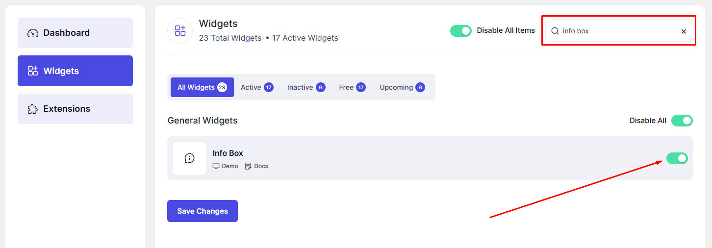
Now, the Info Box widget is ready to use in Elementor.
How to Add an Info Box Widget in Elementor
- Open your page in the Elementor Editor.
- Search for “Info Box” in the Elementor panel under DesignSute widgets.
- Drag and drop the widget into your desired section or column.
- Start customizing the content and design settings.
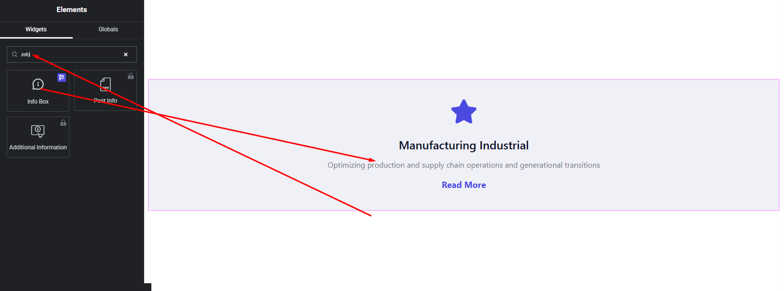
Your Info Box widget is now added and ready to customize.
Content Settings
The Content tab allows you to configure the structure and content of the Info Box.
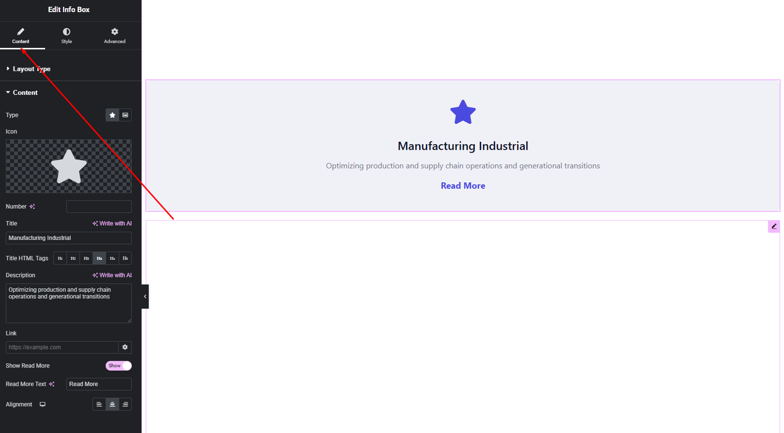
Available Options:
- Layout Style – Choose from 2 different layout styles.
- Icon / Image –
Select an icon or upload an image to represent the info box visually. - Title – Enter the main heading text.
- HTML Tag – Choose the appropriate HTML tag (H1–H6) for SEO and content structure.
- Description – Add supporting text to explain the information.
- Button –
Enable a button and set:- Button text
- Button link
- Alignment – Align the Info Box content (Left, Center, Right).
These options help you structure informative and visually balanced info boxes.
Style Settings
The Style tab gives you full control over the visual appearance of the Info Box.
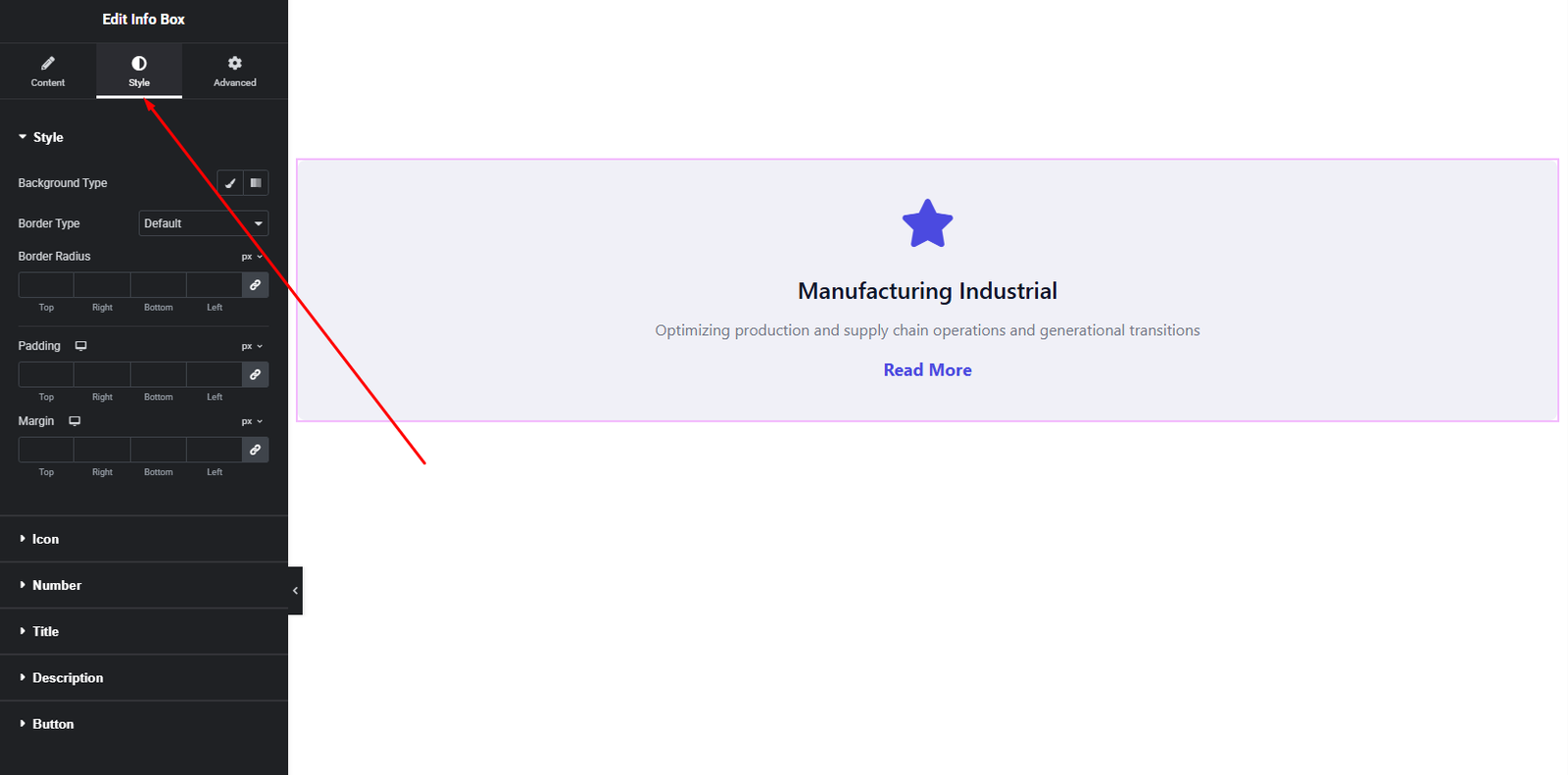
Icon / Image Style
- Size
- Color (for icons)
- Background
- Border & radius
Content Style
- Title Typography & Color
- Description Typography & Color
Button Style
- Typography
- Text color (Normal & Hover)
- Background color (Normal & Hover)
- Border & radius
- Padding
These styling options allow you to match the Info Box perfectly with your site’s branding.
Advanced Settings
The Advanced tab provides additional layout and responsiveness options.
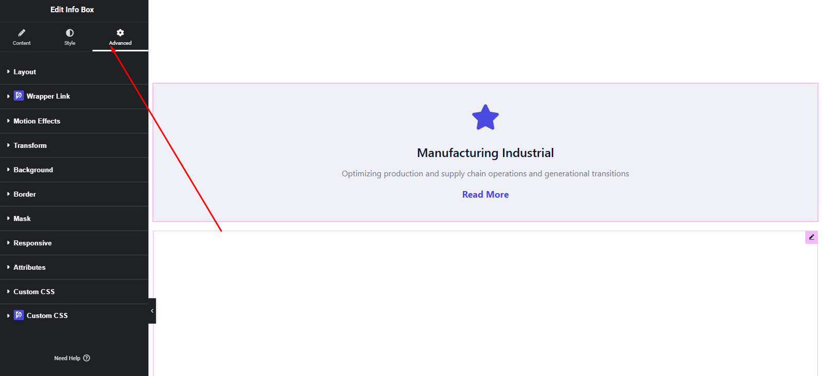
You can configure:
- Margin & Padding
- Background & border settings
- Motion effects
- Responsive visibility
- Custom positioning
Use these options to fine-tune spacing and layout behavior.
Final Outcome
Congratulations! 🎉
You’ve successfully configured the DesignSute Info Box Widget to create clean, informative, and visually appealing content blocks. With flexible layouts, icon or image support, and full styling control, you can now highlight key information and calls-to-action across your website with ease.
If you need further assistance, feel free to reach out to our support team.


