
Overview
The Advanced Accordion widget in DesignSute lets you organize content into expandable and collapsible sections, making it perfect for FAQs, feature explanations, or content-heavy pages. With multiple layout styles, icon controls, schema support, and flexible styling options, this widget helps you present information in a clean, user-friendly way.
It’s especially useful for improving readability and reducing page clutter while still keeping important content easily accessible.
Key Features
- 2 layout styles
- Repeater-based accordion items
- Expand icon support
- Collapse icon support
- Icon position control (Left or Right)
- FAQ schema support
- Full styling controls
- Fully responsive design
Ideal for:
- FAQ sections
- Product feature explanations
- Help & support pages
- Documentation layouts
- Knowledge base pages
How to Activate the Advanced Accordion Widget
Before using the Advanced Accordion widget, make sure it is enabled from the DesignSute Dashboard.
Steps to Enable:
- Go to DesignSute → Dashboard → Widgets (Tab) in your WordPress dashboard.
- Locate the Advanced Accordion widget.
- Toggle it ON to enable the widget.
- Save changes if required.
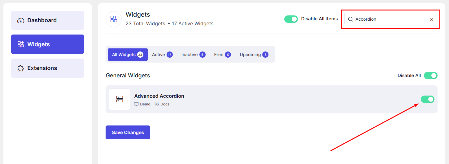
Now, the Advanced Accordion widget is ready to use in Elementor.
How to Add an Advanced Accordion Widget in Elementor
- Open your page in the Elementor Editor.
- Search for “Advanced Accordion” in the Elementor panel under DesignSute widgets.
- Drag and drop the widget into your desired section or column.
- Start adding accordion items using the repeater options.
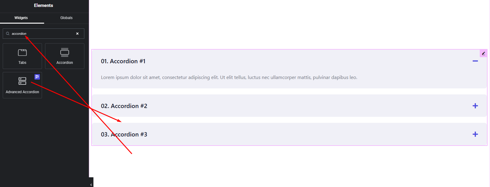
Your Advanced Accordion widget is now added and ready to customize.
Content Settings
The Content tab allows you to configure accordion structure and content.
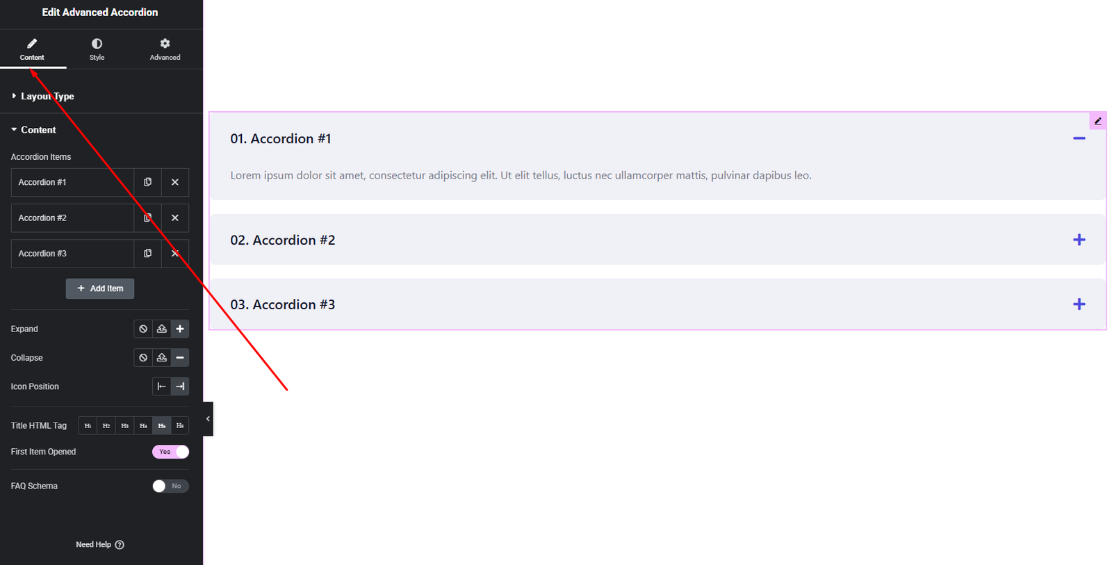
Layout Options:
- Layout Style – Choose from 2 different layout styles.
- Icon Position – Set the position of expand/collapse icons:
- Left
- Right
- Expand Icon – Choose the icon shown when the accordion item is collapsed.
- Collapse Icon – Choose the icon shown when the accordion item is expanded.
- FAQ Schema – Enable this option to add FAQ structured data for better SEO.
Accordion Items (Repeater):
For each accordion item, you can configure:
- Title – The accordion heading.
- Content – The expandable description or answer.
These options allow you to create clear, well-structured accordion sections.
Style Settings
The Style tab gives you full control over the visual appearance of the accordion.
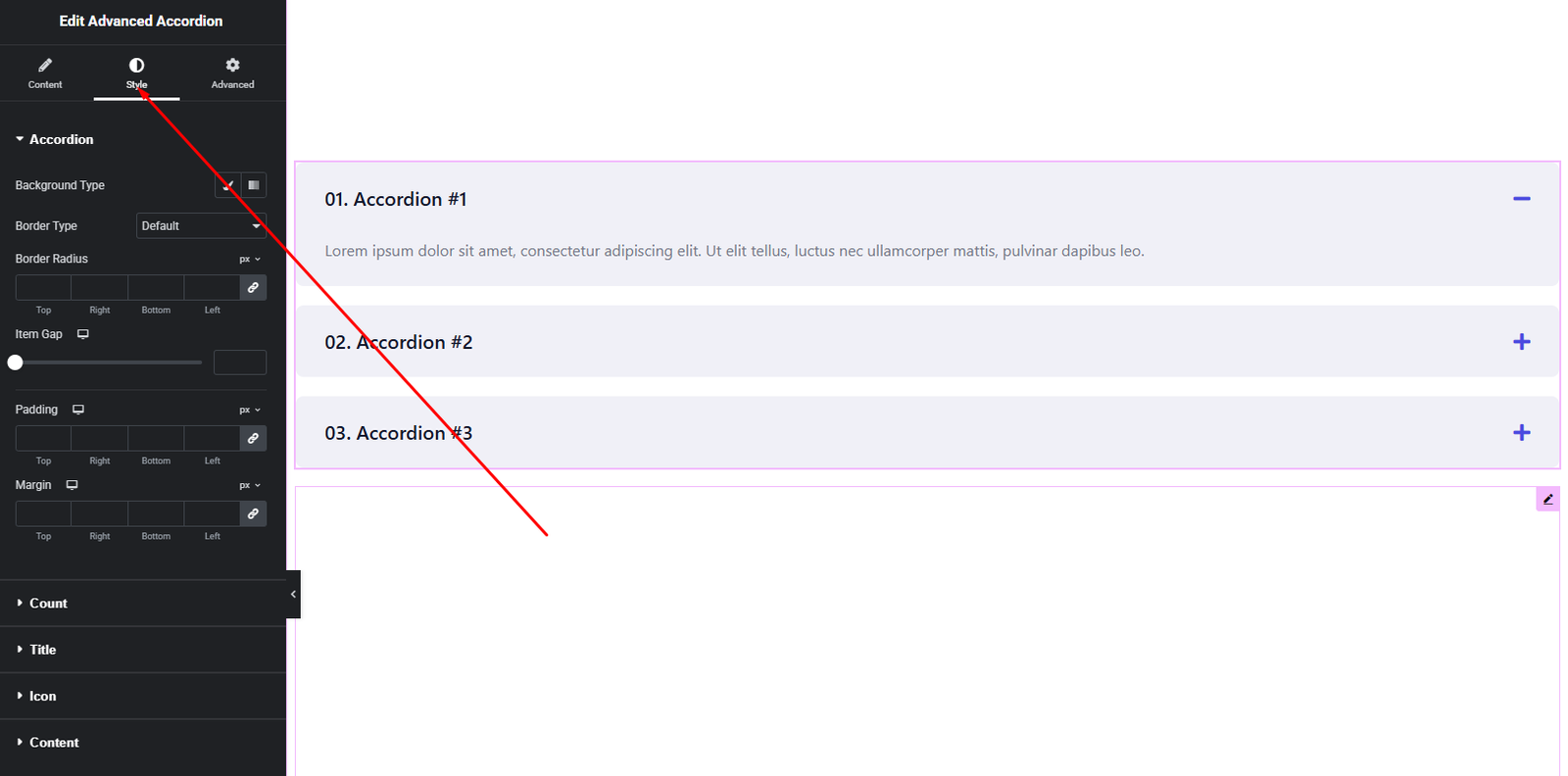
Accordion Item Style
- Background color
- Border & radius
- Spacing between items
Title Style
- Typography
- Text color
- Hover & active state colors
Content Style
- Typography
- Text color
- Padding
Icon Style
- Icon size
- Icon color (normal & active)
- Spacing
These styling controls help you create modern, minimal, or branded accordion designs.
Advanced Settings
The Advanced tab provides additional layout and responsive options.
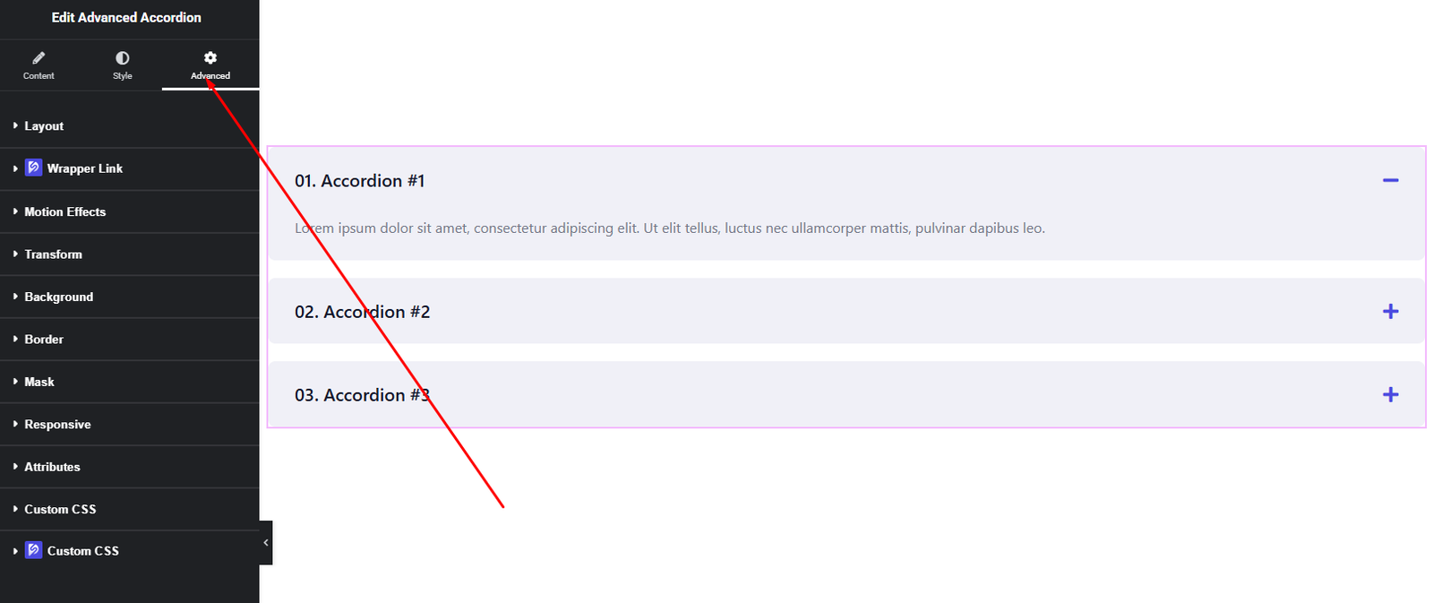
You can configure:
- Margin & Padding
- Background & border settings
- Motion effects
- Responsive visibility
- Custom positioning
Use these options to fine-tune spacing and ensure your accordion looks perfect across all devices.
Final Outcome
Congratulations! 🎉
You’ve successfully set up the DesignSute Advanced Accordion Widget to organize content in a clean and interactive way. With flexible layouts, icon controls, FAQ schema support, and full styling options, you can now create SEO-friendly and user-friendly accordion sections effortlessly.
If you need any further assistance, feel free to reach out to our support team.


